The Continental Corporate Design
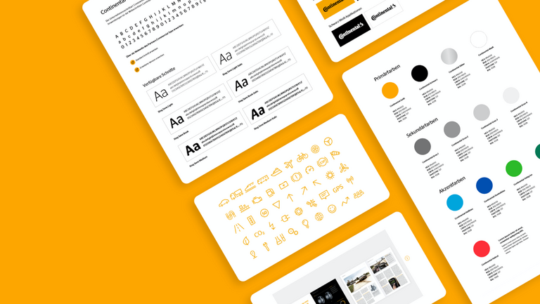
These pages contain comprehensive information on corporate design and its application in various analog and digital media, as well as a variety of useful downloads and templates.
In a dynamic world that is changing in complex ways, there are always new challenges to face. How do we provide people with safe, clean, and efficient mobility? The foundation for overcoming these challenges is a strong brand.
The basics of corporate design are defined in the basic elements. In addition to the striking logo, other visual elements such as colors, font and “quality seal” help to make the overall image of the Continental brand unmistakable.
Quick Guide
As a registered trademark, the logo always consists of a word mark and horse symbol.
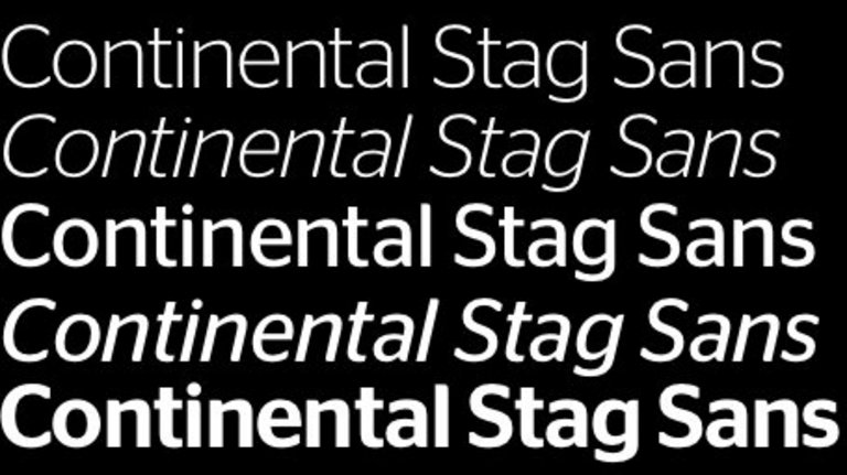
Continental uses different fonts for different applications such as advertising purposes or Office applications.
The four Continental basic colors are crucial for the appearance of the brand. Various accent colors round out the appearance.
Continental icons are icons developed especially for Continental. These icons were developed from the corporate font, Continental Stag Sans, and blend harmoniously with the typeface.
Continental uses a clear, distinctive and recognizable layout principle.

