Adaptive design
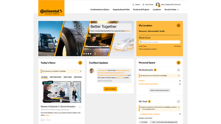
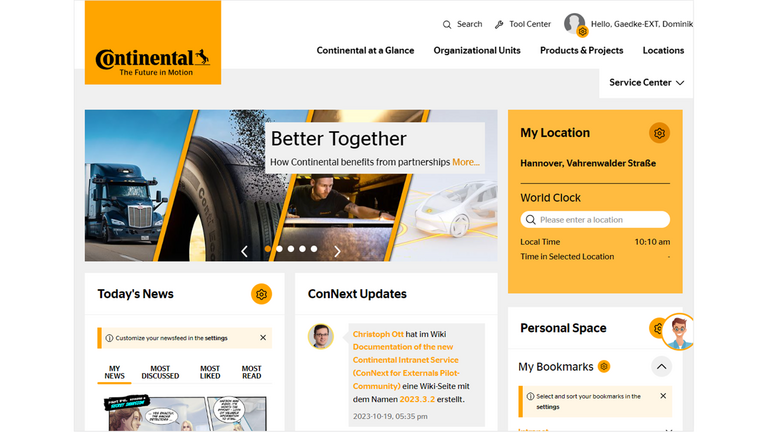
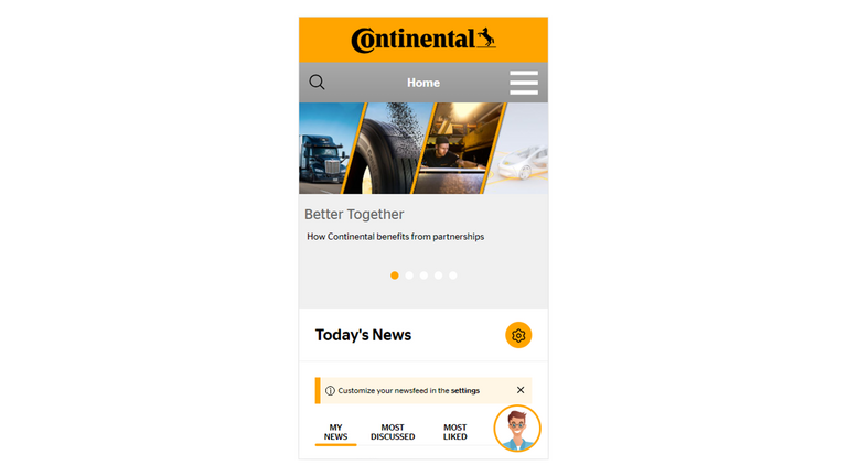
Via device detection, the system identifies the capabilities of the device used for accessing the website so that the appropriate elements of the site can be returned to the user. Layout versions are optimized for the following display sizes:

The content is centered on all devices with a white margin around the entire page. On viewports wider than 1920px the (then empty) background is white.


