Logo and quality seal
The main element of the Continental layout principle is a yellow “tile” that is used on all communication platforms. The tile serves as the “quality seal” and underscores the credibility and outstanding quality of the brand and its products. By always placing the logo on the quality seal, we ensure that the brand is perceived as characteristic, unique, eye-catching and surprising, thus further strengthening the brand image.
The Continental logo is a unit consisting of a striking wordmark and the symbol. Additionally it can be used in combination with the tagline “The Future in Motion”. The logo must always be surrounded by a logo protection area. The protection area defines the minimum margin between the logo and all other design elements.
The obligatory white space around the logo is a protective margin. The logo should never be used without it. The height / width of the protection margin (1x) is equal to half of the logo height (2x).

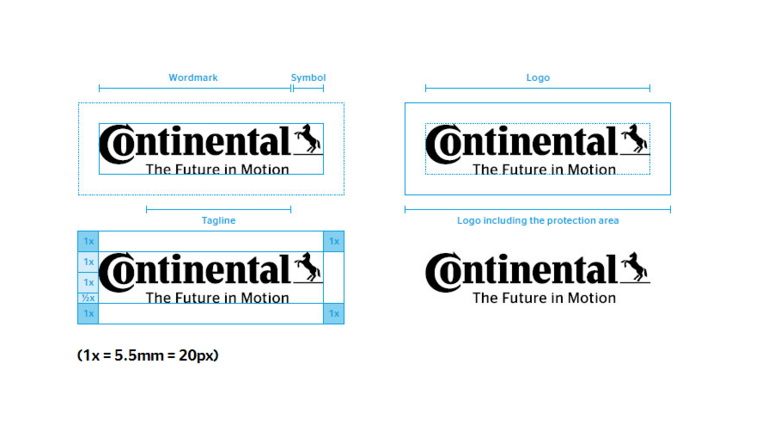
(1x = 5.5mm = 20px)
In general (e.g. front covers), the logo is placed on the quality seal. The width of the quality seal is equal to the width of the logo including the protective area. The height of the quality seal is equal to the height of the logo plus 2x. The logo is placed at the bottom of the quality seal.
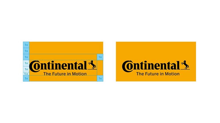
The quality seal smoothly transitions into the Continental logo without the tagline when the header becomes sticky.


The dimensions of the Continental logo and the quality seal are the same for the desktop version as for the tablet landscape version. The distance to the page margin changes according to the page width. The quality seal is left-aligned with the leftmost column.

On mobile devices the logo is placed on a stripe with 100% screen width instead of the quality seal.
