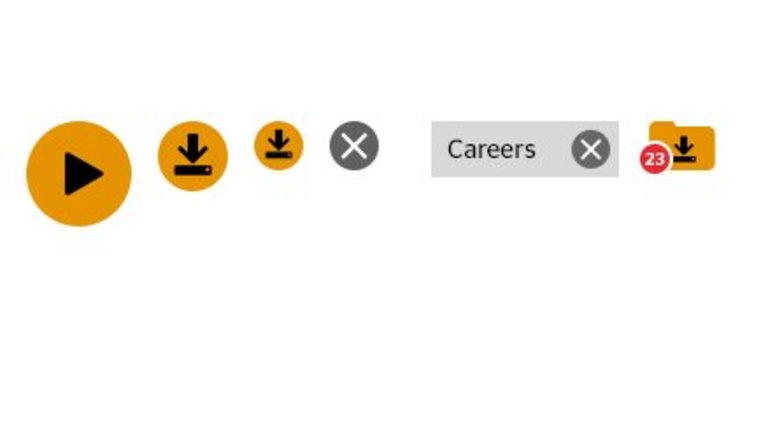
Icons for interaction
While both icons and labels may be used for marking, identifying or indicating, icons are always interactive. They speed up the interaction process because the denoted interaction can be understood intuitively and they are easily identified as visual hotspots.
Icons and text should not be combined. In cases of complex interactions, a text link or button solution may be preferable.
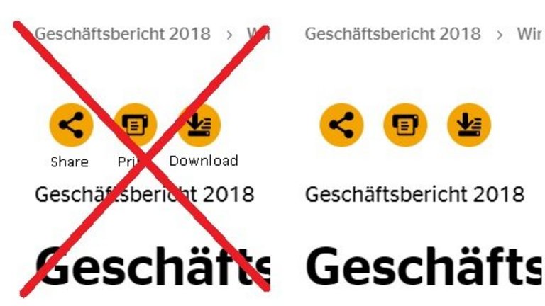
Icons are generally shown on a round gray or yellow background area.
The background area:
- highlights the icons and marks the icons as hotspots;
- protects them visually by providing the necessary contrast to the surrounding content, especially to images;
- prioritizes the icons: Important, expected or preferred interactions are shown on a yellow background color, while less important interactions have a gray background or gray color;
- only icons in groups of at least two may have the gray color. Single icons are always yellow. Exception: the „close“ icon.

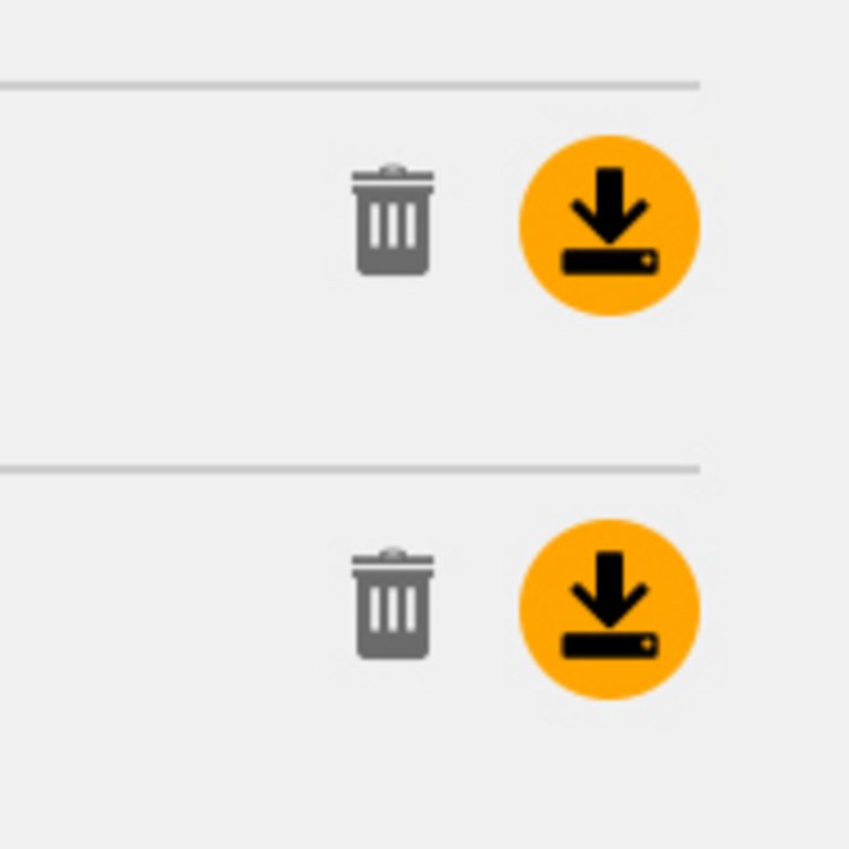
Icons with an extensive rather than linear shape may be used without the mandatory background area. For good contrast, they should be placed on monochrome and light backgrounds.

The icons of temporarily unavailable interactions are “grayed out” by overlaying a light gray pixel pattern.

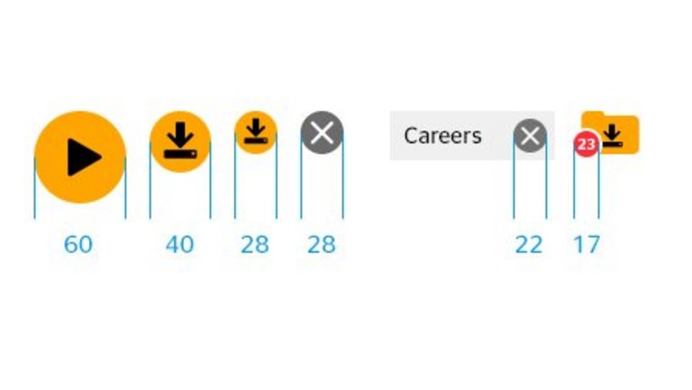
Icons come in fixed diameter sizes: 60px is reserved for video play icons; 40px and 28px are standard sizes for all devices; 22px and 17px are special sizes which are to be used as parts of bigger interaction objects (e.g. the close icon of filters is 22px in diameter). Icons should be deployed as vector data in order to be scalable in full responsive environments.
Icons show a hover / click / tap reaction by adding Continental Black with 10% opacity to the respective background color.
