Grid and columns
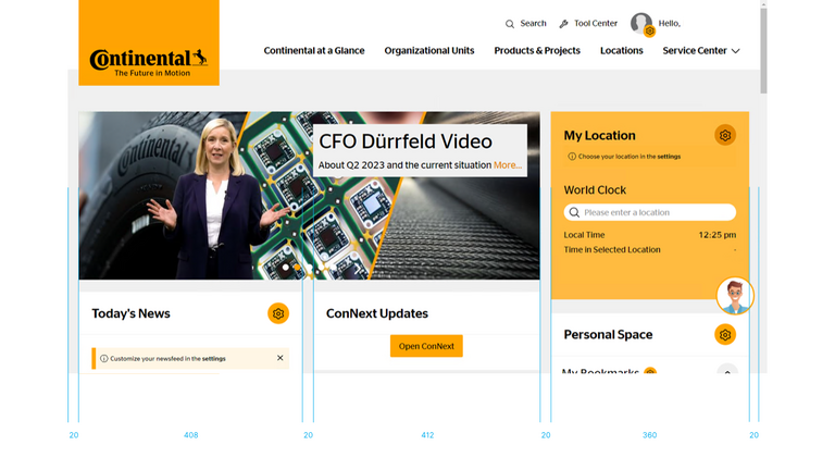
Our grid system consists of three flexible main columns with an inner space.
The flexibility of the columns is limited. The default width is 408px (left column), 412px (center column with 20px space in between) and 360px (right column). The total maximum width of all columns is 840px for the content area. The header could scale up to 1280px.
The layout grid for the biggest screen width consists of three main columns. The default maximum screen width is 1280px. The main content area width is 840px. On the homepage only the content area is splitted into two columns of 408px and 412px with a spacing in between. The mainstage uses the whole width of the content area.

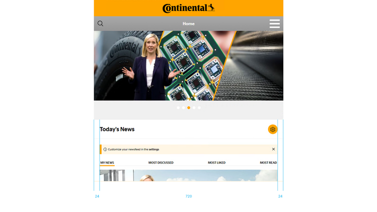
The default maximum screen width is 768px. Content area width is 720px. Again, the only content element whose width uses the content area is the mainstage teaser with a width of 768px including the Continental logo/quality seal and the main navigation (including search icon).

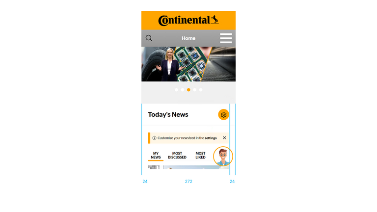
The mobile layout is based on a single column. The default maximum screen width is 320px. The content area width is 272px.
