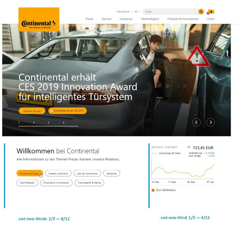
Grid and columns
The layout grid for the biggest screen width consists of three main columns. The default maximum screen width is 1680px. The main content area width is 1440px. Basically, the only content element whose width exceeds the content area is the stage teaser with a width of 1680px.

12 Column Grid: Desktop and tablet landscape
12 columns, column-width of 98 pixels and gutter-width of 24 pixels. Max-width is 1440 pixels.

The tablet portrait layout is based on twelve columns. The default maximum screen width is 768px. Content area width is 656px. Again, the only content element whose width exceeds the content area is the stage teaser with a width of 768px.

12 Column Grid: Tablet portrait
12 columns, column-width of 40 pixels and gutter-width of 16 pixels. Max-width is 656 pixels.

The mobile layout is based on a single column. The default maximum screen width is 375px. The content area width is 332px.

Single Column Grid: Smartphone portrait
A centered single column of 100% width minus 20 pixel margin to the left and right.
